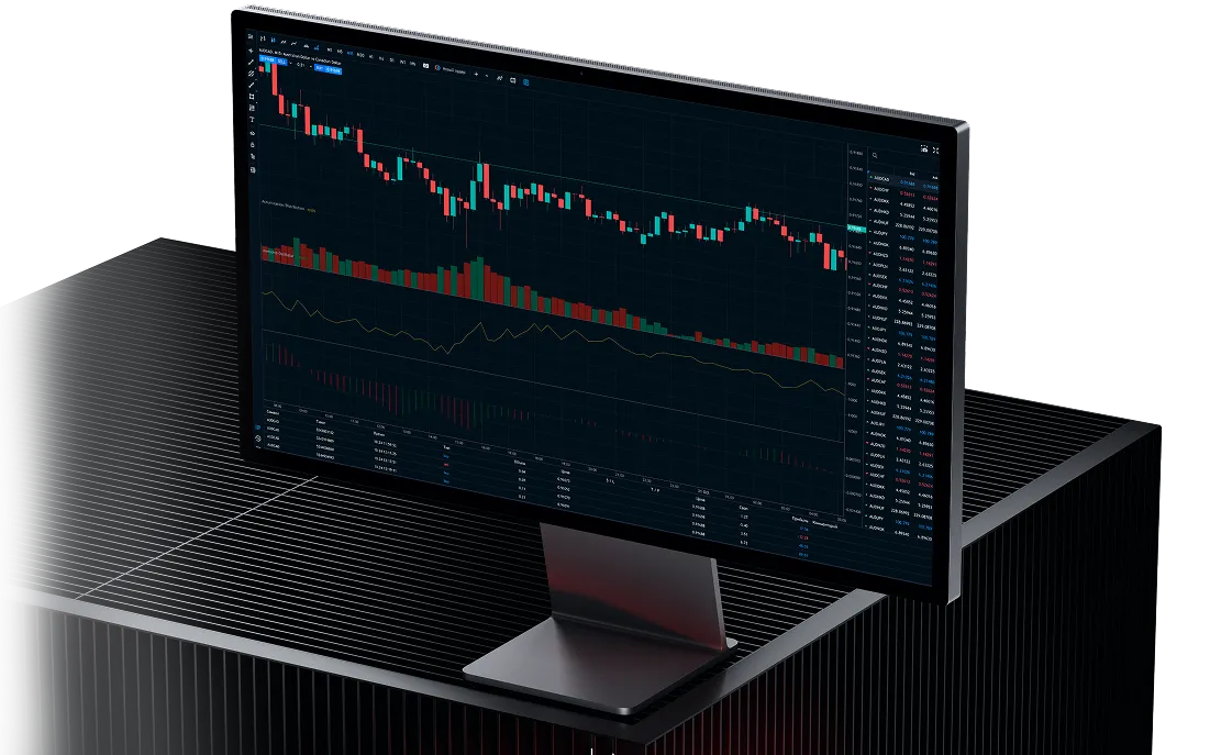
Trading Charts
Get to the heart of price action and seize your opportunity with our free live trading charts for forex, shares, indices, commodities and more. Perform in-depth analysis with 32 indicators and 19 drawing tools.
Benefit from trading charts
Trade at the cutting edge
Take advantage of lightning-fast HTML5 technology and watch market developments in real time
Enhance your analysis
Perform in-depth technical analysis with the help of 32 customisable indicators and 19 drawing tools
Bring charts up-to-date
Keep your charts informed with a curated news and analysis feed, plus add notable dates, like earnings seasons
The types of trading charts

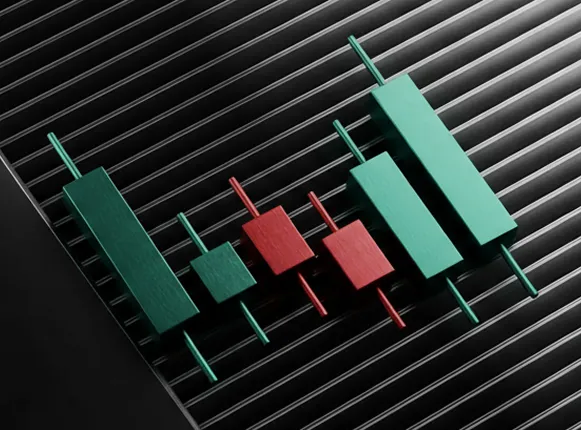
Candlestick chart
Candlestick charts are a vibrant way to visualize pricing trends, characterized by long, slender bars that evoke the shape of candles. Each candlestick encapsulates price movements over a specified timeframe, providing instant insights. A green candlestick shines brightly, signaling a bullish market where prices have surged, closing higher than they opened. In contrast, a red candlestick casts a shadow, indicating a bearish trend where prices have dipped, closing lower than the opening.
These candlesticks reveal crucial information about four key price variables:
Open – The price at the beginning of the period.
Close – The price at the end of the period.
High – The peak price reached during the period.
Low – The lowest price recorded throughout the period.
The interplay between these four prices within a candlestick offers valuable insights into market dynamics, shedding light on whether buyers or sellers are currently influencing the price action.

Heikin-Ashi
On first encounter, Heikin-Ashi bars may look very similar to the candlestick chart. But, there is a significant difference between the two. Heikin-Ashi, which more or less translates from Japanese as ‘average pace’, gives you an indication of price averages – and their changes – over a period.
Heikin-Ashi charts are smoother than candlesticks and, rather than offering an exact price at any moment, are often looked to for determining general trends over longer timeframes. The opening price of a Heikin-Ashi bar is the mid-point of the previous bar, and the closing price equals the average price for the current time period.
In short, each Heikin-Ashi bar shows you the direction and magnitude of every period’s change in average price level. For example, a long green bar will indicate that the average price has increased substantially. Conversely, a long red bar tells you that the average price in the market has dropped significantly.

HLOC chart (bar chart)
HLOC, which stands for “High, Low, Open, Close,” presents the same essential data as a candlestick chart but in a distinctive format. Here’s how it works:
- The open price is depicted by a horizontal notch on the left side of the vertical line.
- The close price is illustrated by a horizontal notch on the right side of the vertical line.
- The high price is marked at the very top of the vertical line.
- The low price is indicated at the bottom of the vertical line.
Just like the candlestick, the HLOC line flashes green when the market has risen during the specified period, closing higher than it opened, while it turns red if the asset’s price has fallen, finishing lower than its opening price.

Line chart
Line chart simplifies the presentation of price data by focusing solely on the close prices for a selected time period (like one hour). These closing prices are seamlessly connected, creating a continuous line that illustrates the market’s performance.
This straightforward approach provides a clear visual of pricing trends, but it lacks any insight into the high, low, or open prices for that period. Because of this limitation, many traders prefer to use line charts primarily for analyzing long-term trends, where the finer details may not hold as much significance compared to short-term trading patterns.
When navigating the dynamic landscape of short-term volatility—such as in the fast-paced forex market—having precise information on the extent and speed of price movements is crucial. In these scenarios, knowing the exact market price at any moment is essential, making candlestick or HLOC bar charts far more valuable sources of data. They equip traders with the detailed insights necessary to make informed decisions in a rapidly changing environment.

Mountain chart
The final type of chart is the mountain chart, which is essentially a variation of the line chart. The key difference lies in the shading beneath the line, giving the chart a striking silhouette reminiscent of a mountain range. Like line charts, mountain charts are primarily utilized to analyze long-term trends, as they do not display the high, low, or open prices for each period.
The shaded area creates a powerful visual that quickly conveys the overall shape of the market and its volatility. Frequent peaks and deep valleys accompanied by steep gradients signal heightened levels of volatility, while smoother gradients indicate a more stable market environment.
Furthermore, technical indicators, such as Bollinger Bands, are often more easily interpreted when overlaid on mountain or line charts rather than on candlestick or HLOC bar charts. This makes mountain charts a valuable tool for traders seeking to capture a clear and immediate understanding of market trends and conditions.
Free trading charts for forex, shares, indices, commodities and more
Access our free trading charts by opening a demo or click on a market below to see a preview.


Available Platforms


Full-featured trading on the go with real-time sync.